Custom plotting
During a BLISS session, users may create data (other than scan data) that needs to be displayed graphically. Flint offers a collection of different type of plots (curve, scatter, image…) so user can select the one that fit the with the data to be displayed.
Available kind of plots
Here is a the available set of plots for different use cases.
This can grow for general use cases.
General use case
Dedicated use case
- Display curves
- Display a single image
- Display a single scatter
- Display curves in time
- Display a curve stack
- Display an image stack
Containers
Custom plot class
If none of this viewers fit your needs, there is still a way to write your own plot embedded inside Flint.
See the custom plot class documentation.
APIs
Any of this custom plots provides a common API, which is described here.
Create a plot from shell
First a plot has to be created from Flint.
The first argument (here curve) is used to select the kind of expected plot.
See the specific documentation for each kind of plots to know what to use.
f = flint()
p = f.get_plot("curve")
Other arguments are available to edit some behavior of this plot.
A title can be specified, a unique name can be set to reuse plots instead of creating a new one. The plot can be closeable (default is true) or selected by default at the creation (default is false).
p = f.get_plot("curve",
               name="My plot title",
               unique_name="myplot42",
               closeable=True,
               selected=True)
Create plot in scripts
Flint and it’s plot API can be imported the following way:
from bliss.common.plot import get_flint

f = get_flint()
p = f.get_plot("plot1d", name="My plot")
Select the tab location
A custom plot is usually displayed in it’s own tab.
But it can be moved in the live window.
This can be requested at the creation with the in_live_window argument.
By default this argument is None, meaning it will be displayed in the live window
only if a container already exists.
p = f.get_plot("curve",
               name="My plot title",
               unique_name="myplot42",
               in_live_window=True)
The location of the plot can also be changed manually with the UI after the creation.
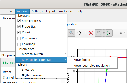
See the dedicated actions provided in the 📃Windows menu.
Life cycle
The plot life cycle can be checked and changed with this commands:
if p.is_open():
    p.close()
Set focus
Set the focus on a specific plot can be set the following way:
p.focus()
Logbook
A plot can be exported to the logbook this way:
p.export_to_logbook()